When you enter a room, the first thing that catches your eye is the color of the walls. Colors contain energy and affect human emotions and cognitive processes. When we see colors, a message is sent to our nervous system that affects our emotions. Colors have an amazing power to change our mood. For example, it can provoke anger, induce happiness, or bring feelings of indifference, sadness, and grief to mind. So, color psychology in interior design is important here. To continue, we explain the effect of the science of color on your home decoration. Also, we will learn which colors are among the most widely used colors in home decoration or how the science of color psychology helps us design home decoration.
Understanding color theory
As shown below, a color wheel is considered the main tool for mixing different colors and learning about color psychology in interior design. There are at least 12 colors in each color wheel. These colors are divided as follows:
Primary colors: red, blue, and yellow are the basic colors that cannot be obtained by mixing other colors.
Secondary colors: orange, purple, and green. To make these colors, you should mix the primary colors.
Tertiary colors: A combination of primary and secondary colors creates tertiary colors, which usually have two-word names such as red-purple or yellow-orange.
All the colors described above can be divided into three opposing groups in color theory: cool, warm, and neutral. Cool colors are in the green-blue part of the color wheel. Since they create a feeling of coldness in humans, they are called cool colors. Warm colors are the opposite of cool colors because they are associated with the feeling of warmth. Yellow, orange, and red are shades of warm colors. Finally, neutral colors are not present in the color wheel; including gray, brown, and beige.

Color effects on mood and behavior
As we know, color psychology in interior design has an important effect on decoration. So, it should have paid attention to. While color perception is somewhat subjective, some color effects have universal meanings. Colors that are placed in the red region of the color spectrum evoke feelings ranging from warmth and comfort to feelings of anger and hostility. Colors on the blue side of the spectrum are often described as calming, but they can also evoke feelings of sadness or indifference. Each color is usually known to symbolize a specific concept and convey a specific message. Here are some of the most well-known meanings that people have attributed to each color:
Warm colors:
Red: Passion, excitement, love;
Yellow: hope, joy, danger;
Orange: warmth, kindness, happiness;
Cool colors:
Purple: mysterious, noble, glamorous;
Blue: wisdom, hope, peace;
Green: nature, growth, freshness;
Neutral colors:
White: truth, indifference;
Beige: peace, security;
Black: noble, mysterious, cold
Grey: peace, calm.

The room-by-room color guide and color psychology in interior design
According to color psychology in interior design, each room should be decorated with appropriate colors based on its function. In addition to their aesthetic appeal, colors can also be effective in regulating the lighting in a home. If we use dark colors, the interior will appear darker; while light colors will increase the brightness. One reason for this is the issue of “reflection.” Dark colors absorb light, but light colors can reflect light and cause it to reflect. The reflected light flows through the interior decoration and more of its rays reach our eyes, which is why an environment with light colors appears brighter than an environment with dark colors.
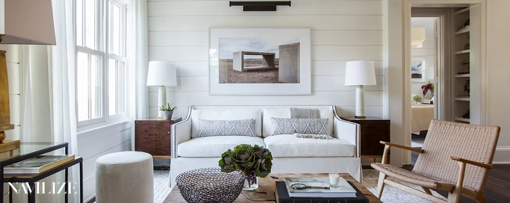
Living Room
Best color combinations
Color psychology in interior design says that white is almost the only color that can be combined with all colors. One of the best color combinations in living room decoration for floors or walls is to choose white. Also, beige is a special color among interior decoration colors and has many fans. It is very common to use this color for furniture and curtains. Red is also a good choice. It is full of energy, the more intense it is, the more energy it will have. That is why it can greatly stimulate the release of adrenaline in humans. This color is recommended for the living room or dining area because it can encourage people to talk to each other.
Colors to avoid
On the contrary, it is better not to use orange and yellow colors in large halls.
Accent color tips
Besides these colors, the combination of cream and brown is always stylish and attractive, and many people still like this color combination for their home decoration.

Kitchen
Best colors combinations
According to color psychology in interior design, white is the most suitable color for decoration, especially in a small kitchen. Next, pink, cream, green, gray, blue, and gold can be suitable colors for kitchen appliance design. These colors look very good with white. Green seems to be an appropriate color for almost all places. Using green as the main color of interior decoration brings peace, and using it in the kitchen gives it freshness and vitality. Red also stimulates the appetite.
Colors to avoid
It should be noted that colors like red should not be used excessively.
Accent color tips
For using each color, it’s better to combine it with white. This helps your kitchen to look brighter.
Bedroom
Best color combinations
Blue is known as the color of peace and it is often recommended for bedrooms and bathrooms. Blue reduces blood pressure and heart rate and slows down breathing. Therefore, using it as the main color may sometimes cause stagnation and unpleasant feelings. Also, Dark purple is a luxurious and eye-catching color for interior decoration and makes it look creative. Light purple is also suitable for bedrooms; this color has the same positive effects as blue but does not have negative characteristics such as creating a feeling of fatigue.
Colors to avoid
Orange creates a feeling of enthusiasm and excitement and is considered an energetic color. Therefore, it is not a good color for the bedroom or living room.
Accent color tips
You can use bright colors to cheer people in the bedroom.
Bathroom
Best color combinations
The most suitable colors for bathrooms are white and green-blue. Pink can be a beautiful color too.
Colors to avoid
There is no limitation in choosing colors for bathrooms, but dark colors are used less.
Accent color tips
Pay attention to combinations and the location of each color. For example, white would be a perfect color for walls.
Home office
Best color combinations
Black is a sign of independence and seriousness in work and, if desired, can be used in some parts of the office along with bright colors. Dark brown is another dark color. Different tones are used as a color combination for the management office. It gives a sense of power and authority to the environment. Dark gray is also very suitable for environments that require high concentration and energy storage.

Colors to avoid
Normally, very bright colors like orange and pink are not suggested for the home office.
Accent color tips
For your home office use white and cream to make it big.
Color selection process
To select a color and pay attention to color psychology in interior design, act as below:
Consider natural light
If your room has a lot of natural light, you can use dark colors like dark blue, dark green, or gray. However, if the room has little natural light, it is better to use light colors to make the space seem brighter and more spacious.
Room function
Another point to consider when choosing a color is the room function. For example, if the color of the bedroom is light, it will provide a more comfortable sleep experience for people. On the contrary, choosing dark colors for the office will inspire seriousness and effort in doing work. For the living room, it is better to use a combination of colors that both reflect the light of the room well and make the hall appear larger.
Space size
When choosing a color, paying attention to the physical dimensions of the room is important. Designers can find the right color combination based on the size of the room and even its geometric shape. This is necessary to create dynamism in the space. For example, in small spaces, it is better to have less variety of colors so that more stillness and peace prevail.
Existing elements
Sometimes colors are determined by the accessories and decorative items in the room. Paying attention to the parquet, curtains, and other elements will affect the choice.
Common color mistakes in color psychology in interior design
Common color mistakes are ignoring natural light, choosing colors that are too bright, testing a small amount of paint on the wall, over-matching colors, using white to brighten a dark space, ignoring shadows, not considering the color of the floor, and dividing the spaces of the house using two different colors.

Trust Navilize for the best color choice
If you are thinking about color psychology in interior design, we are the best consultant for your home design. Our online consultation is at your service for finding the right color palettes, or even for more complete services such as interior design and interior architecture. View the portfolio and choose a beautiful color wisely. Beautify your home with us!