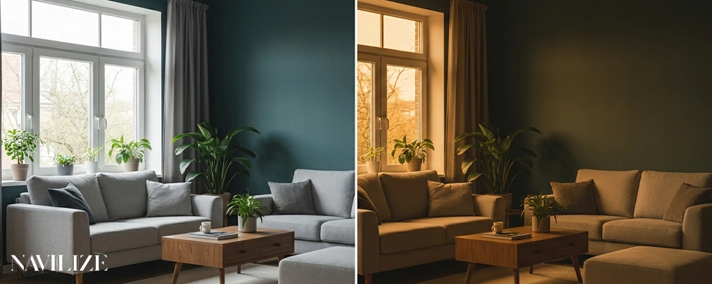
There’s a reason professional designers never choose paint colors from a small chip held under a store’s fluorescent lights. The color you see in that moment has almost nothing to do with what you’ll live with on your walls. Lighting doesn’t just illuminate paint — it actively changes it. Understanding why is the difference between a room that works and one that never quite feels right.
Why Colors Look Different Throughout the Day
Natural light shifts constantly, and your paint shifts with it. A warm greige that looks grounded and sophisticated at noon can turn flat and lifeless by 4 p.m., then pick up a distinctly purple cast after sunset when you switch on your lamps.
This happens because daylight changes color temperature throughout the day. Morning light tends to be warm and golden (around 2,000–3,000K). Midday light is the most neutral and closest to true white (5,000–6,500K). Late afternoon light turns warm again, often with an orange or amber quality. Overcast days push everything toward cool blue-gray.
The direction your room faces amplifies this. North-facing rooms receive indirect light all day — cooler, more consistent, and often flattering to blues and greens but harsh on warm neutrals, which can look muddy or gray. South-facing rooms get the most light and the widest range of color shifts. East-facing rooms are warm in the morning and cool by afternoon. West-facing rooms do the opposite.
A color I specified for a south-facing living room — a warm off-white with yellow undertones — looked completely different in the client’s north-facing bedroom. Same paint, same finish, entirely different result. The north light stripped out the warmth and left something closer to institutional beige.
Natural Light vs Artificial Light
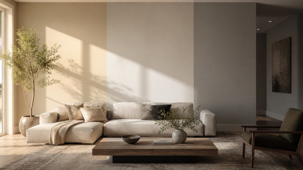
Natural light is the standard against which everything else is measured, but most people spend the majority of their time at home under artificial light. This is where paint choices go wrong most often.
The key metric is Color Rendering Index (CRI). A light source with a CRI of 100 renders colors exactly as they appear in natural sunlight. Most residential LED bulbs fall between 80 and 90 CRI — acceptable, but not perfect. Bulbs below 80 CRI will visibly distort colors, making reds look brown, blues look gray, and warm neutrals look flat.
For rooms where color accuracy matters — a home office, a kitchen, anywhere you’re making decisions about how things look — use bulbs rated 90 CRI or higher. The difference is immediately visible.
Beyond CRI, the color temperature of your bulbs matters just as much:
- Warm white (2,700–3,000K): Adds yellow-orange cast. Flattering for skin tones and cozy spaces. Makes cool colors (blues, greens, grays) look warmer and sometimes muddy.
- Neutral white (3,500–4,000K): Closest to natural daylight. Most accurate for color rendering. Works well in kitchens and workspaces.
- Cool white/daylight (5,000–6,500K): Blue-toned. Makes cool colors pop and warm colors look washed out or stark.
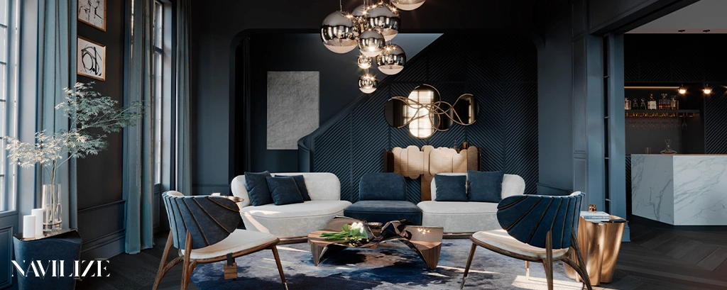
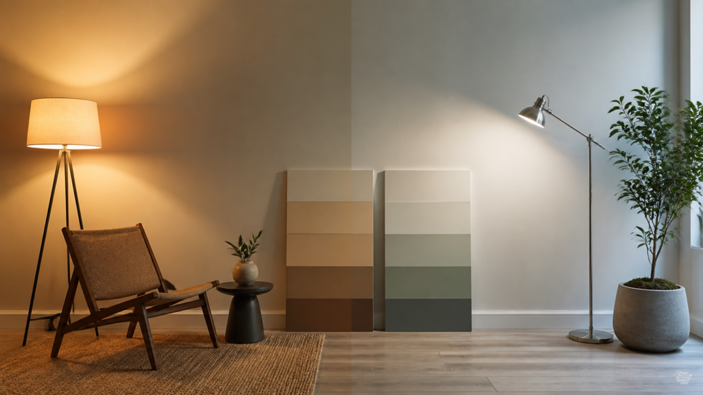
A deep navy wall under warm 2,700K lighting will look rich and moody. Under 5,000K daylight bulbs, that same navy reads sharper and more electric. Neither is wrong — but they’re not the same color.
Warm Light vs Cool Light
The warm vs cool distinction is the single most practical thing to understand when choosing paint, because it determines which colors will work in your space and which will fight against your lighting.
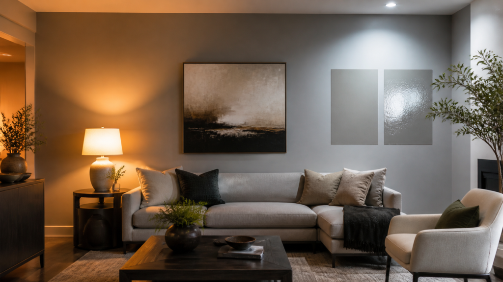
Warm light sources (incandescent, warm LED, candlelight) add yellow and orange to everything they touch. This is why warm neutrals — creams, taupes, warm whites — look so good in traditionally lit rooms. The light reinforces the undertone already in the paint. But put a cool gray under warm light and you’ll often get something that reads as lavender or mauve — the warm light hits the blue undertone in the gray and shifts it toward purple.
Cool light sources do the opposite. They enhance blues, greens, and true grays while making warm colors look pale or washed out. A terracotta wall that looks vibrant and earthy under warm light can look almost salmon-pink under cool daylight bulbs.
The practical rule: match your paint’s undertone to your dominant light source, or use a neutral undertone that can hold up under both. Undertone-neutral colors — true whites, balanced greiges, certain soft greens — are more forgiving across different lighting conditions than colors with strong warm or cool leans.
One thing worth knowing: LED technology has made this more complicated, not less. LEDs can be manufactured to almost any color temperature, and the quality varies significantly between brands. Two bulbs both labeled “warm white 2,700K” can render colors differently depending on their phosphor composition. If you’re repainting a room and changing the lighting at the same time, test both together before committing.
How Designers Test Paint Colors Before Committing
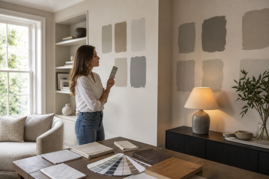
The standard advice — buy a sample pot and paint a small square on the wall — is correct but incomplete. Here’s how to actually use that sample effectively.
Paint large swatches, not small ones. A 4×4 inch square tells you almost nothing. Paint at least a 12×12 inch area, ideally larger. Color perception is affected by simultaneous contrast — the colors surrounding a swatch influence how you read it. A larger sample gives you a more accurate read.
Test on multiple walls. The same color will look different on a wall that receives direct light versus one in shadow. Paint samples on both and observe them at different times of day.
Observe at every relevant hour. Morning, midday, late afternoon, and evening under your actual artificial lighting. Take photos at each point — your camera will capture color shifts your eye adapts to and misses.
Use the right background. If you’re painting over a dark color, prime the sample area first. Dark undertones bleed through and make any color look different than it will once properly applied.
Look at the sample against your fixed elements. Hold fabric swatches, flooring samples, and furniture photos next to the painted swatch. Paint doesn’t exist in isolation — it has to work with everything already in the room.
One tool worth knowing: spectrophotometers, which many paint stores use to match colors, measure the actual light reflectance of a color rather than relying on visual matching. If you’re trying to match an existing color or verify that a paint will behave consistently across different lighting, a store with this equipment can give you objective data rather than guesswork.
For rooms with complex lighting situations — multiple sources, dramatic natural light variation, or a mix of warm and cool fixtures — working with an interior design professional can save significant time and money. Getting the paint wrong after everything else is in place is an expensive mistake.
Lighting Mistakes That Change the Look of Your Home
These are the errors that consistently produce rooms where the paint “just doesn’t look right” — even when the color itself was a good choice.
Choosing paint under store lighting. Retail lighting is designed to make products look appealing, not to simulate your home. It’s almost always cool and bright. Colors that look crisp and clean in a store can look cold and harsh in a residential setting.
Testing samples only at one time of day. Most people look at samples in the afternoon when they have time to go to the store. If you live in your home primarily in the evenings, that’s when the color matters most. Test it then.
Ignoring the effect of adjacent rooms. If a hallway connects two rooms painted different colors, the light bouncing between them will affect how each color reads. A warm orange in the hallway will cast a warm glow into a room painted cool gray, shifting it toward a color you didn’t choose.
Using mismatched bulb temperatures in the same room. A ceiling fixture at 3,000K and a floor lamp at 5,000K will create competing color casts that make the room feel visually unsettled. Standardize your bulb temperature within a room.
Forgetting about lamp shade color. A cream or amber lamp shade warms the light passing through it. A white shade keeps it neutral. This affects the color cast on nearby walls more than most people realize.
Underestimating the impact of sheen. Matte finishes absorb light and make colors look slightly darker and more muted. High-gloss finishes reflect light and can make colors look more saturated or washed out depending on the angle. The same paint color in flat versus semi-gloss will read differently on the wall — not just in texture, but in apparent hue.
Getting lighting and paint right together is one of the more nuanced parts of interior design, and it’s one of the areas where Navilize consistently helps clients avoid costly do-overs. The variables interact in ways that are hard to predict without experience — but once you understand the underlying principles, you can make confident decisions rather than hoping for the best.
FAQ
Does lighting really change paint color that much?
Yes — significantly. The same paint can shift several shades in apparent warmth, saturation, and even hue depending on the color temperature and CRI of your light source. This isn’t a subtle effect; in some cases it’s dramatic enough to make a color look like an entirely different choice.
What color temperature bulb is best for seeing paint colors accurately?
Neutral white bulbs in the 3,500–4,000K range with a CRI of 90 or higher give the most accurate color rendering. For rooms where you want warmth rather than accuracy, 2,700–3,000K is standard — just account for the warm shift when choosing paint.
Why does my gray paint look purple or blue?
Gray paint almost always has an undertone — blue, green, purple, or warm. Under warm lighting (2,700–3,000K), the warm light hits the cool undertone and shifts it toward purple or lavender. This is one of the most common paint surprises. To avoid it, test your gray sample under your actual lighting conditions before committing.
How do I choose paint for a north-facing room?
North-facing rooms receive cool, indirect light all day. Warm undertones — creams, warm whites, soft yellows, warm taupes — tend to hold up better than cool colors, which can look cold or flat. If you want a cool color in a north-facing room, choose one with enough depth and saturation to read well without warm light reinforcing it.
Should I match my paint undertone to my light bulb color?
Generally yes. Warm-undertone paints work well under warm bulbs; cool-undertone paints work better under neutral or cool light. Matching undertones to light source creates consistency. Mismatching them can produce unexpected color shifts — sometimes interesting, often not what you intended.
Can I use the same paint color in rooms with different lighting?
You can, but it will look different in each room. Test the sample in each space under its actual lighting conditions before deciding. What works beautifully in a south-facing room may not work in a north-facing one, even with identical paint.