When most people decide to redecorate, they head straight to the paint store. It feels like the logical starting point — pick a color you love, then build the room around it. But professional interior designers almost never work this way. In fact, paint is typically one of the last decisions they make, not the first.
Here’s why that approach leads to better results, and how you can apply the same thinking to your own home.
Why Paint Is Usually the Last Design Decision
The Common Mistake Most Homeowners Make
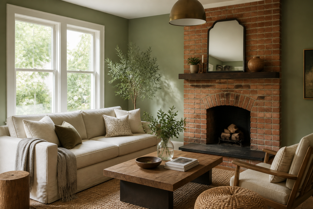
The scenario plays out constantly: someone falls in love with a dusty sage green at the hardware store, paints their living room, then spends months trying to find a sofa, rug, and curtains that don’t clash with it. What started as an exciting refresh turns into a frustrating puzzle.
The problem isn’t the color — it’s the sequence. Paint chosen in isolation becomes a constraint. Every subsequent purchase has to work around it, and the options narrow fast.
Why Paint Is the Most Flexible Design Element
Here’s something the paint industry doesn’t advertise: a gallon of paint is one of the cheapest, most reversible decisions in any room. A sofa costs hundreds or thousands of dollars and takes weeks to deliver. Hardwood flooring is installed once and lives in your home for decades. Custom cabinetry is essentially permanent.
Paint, by contrast, can be changed in a weekend for under $100.
This flexibility is exactly why designers save it for last. Once every fixed and semi-fixed element is in place, the right paint color often becomes obvious — it’s the one that ties everything together, not the one that started the whole process.

What Professional Designers Choose Before Paint
Before a designer even opens a paint fan deck, they’ve already made decisions about the room’s most permanent elements. These are the anchors of the space.
Furniture
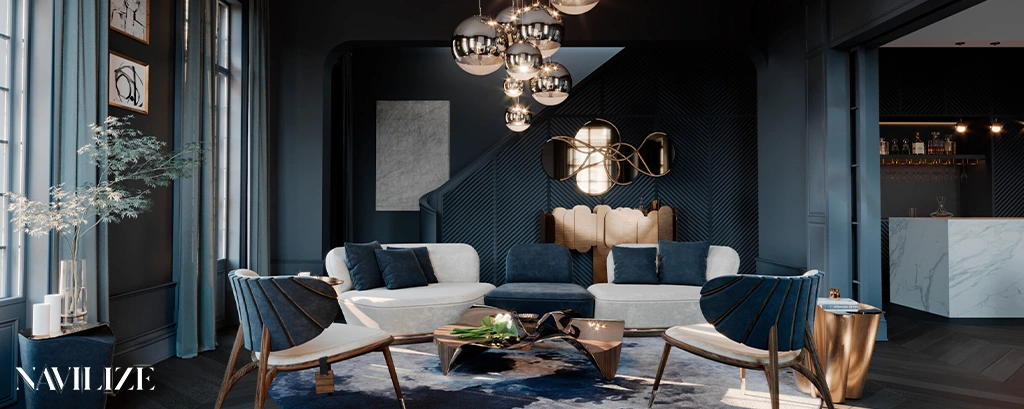
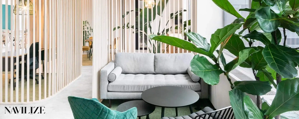
Large upholstered pieces — sofas, sectionals, armchairs — set the dominant tone of a room. Their fabric, texture, and undertones create a color story that paint needs to support, not compete with. A warm-toned linen sofa calls for different wall treatment than a cool charcoal velvet one.
Flooring
Flooring covers more square footage than any other surface in a room. Whether it’s warm honey oak, cool gray tile, or deep walnut, the floor’s undertones will influence how every wall color reads. A paint color that looks perfect on a sample card can shift dramatically once it’s surrounded by a specific floor tone.
Cabinets
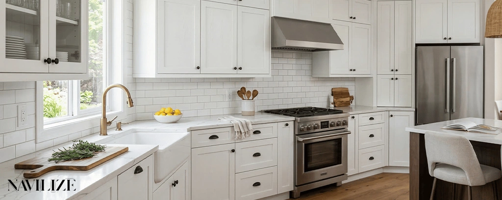
In kitchens and bathrooms, cabinetry dominates the visual field. Cabinet finishes — whether painted, stained, or lacquered — carry strong undertones that must be considered before any wall color is chosen. A white cabinet with pink undertones needs a very different wall color than one with green or gray undertones.
Countertops
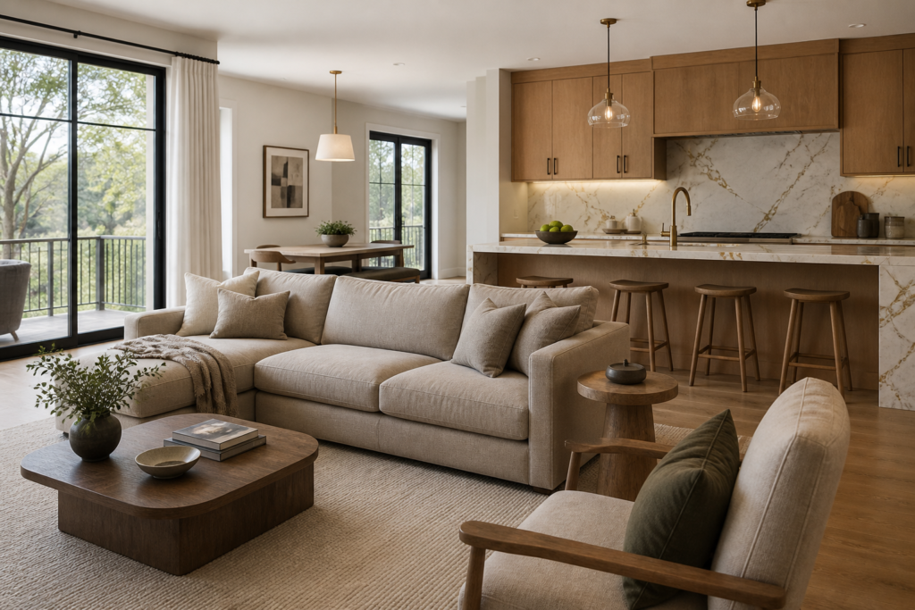
Stone and engineered countertops often contain multiple colors simultaneously. A quartz countertop with warm cream, gray, and gold veining is essentially a ready-made palette. Designers pull from those existing tones rather than introducing new ones that compete.
Lighting
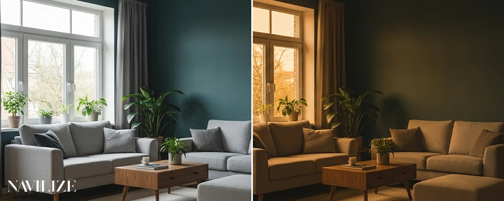
Both natural and artificial light transform paint color in ways that no sample chip can fully predict. A north-facing room with cool, indirect light will make the same paint color look entirely different than a south-facing room flooded with warm afternoon sun. Designers assess the light quality of a space before committing to any color — because the same paint can read as blue-gray in one room and lavender in another.
This is why understanding how lighting affects color perception is a foundational skill in professional color planning. The light in your room isn’t neutral — it has a color temperature and direction that actively changes what you see on the walls.
How Designers Build a Color Palette Before Choosing Paint
Fixed vs Flexible Elements
Professional designers mentally sort every element in a room into two categories:
Fixed elements — things that are expensive, difficult, or impossible to change:
- Flooring
- Cabinetry
- Countertops
- Architectural features (brick, stone, exposed beams)
- Large upholstered furniture
Flexible elements — things that can be swapped relatively easily:
- Paint
- Throw pillows and textiles
- Rugs
- Decorative accessories
- Lighting fixtures
The rule is simple: fixed elements drive the palette. Flexible elements respond to it.
Creating Visual Balance
Once the fixed elements are identified, designers look for the undertones they share. Most rooms have a dominant undertone running through the flooring, furniture, and architectural details — even if it’s subtle. Paint is then chosen to either harmonize with that undertone (for a cohesive, calm feel) or provide deliberate contrast (for energy and definition).
A common professional technique is to pull a secondary or tertiary color from an existing pattern — a rug, a piece of artwork, an upholstery fabric — and use it as the wall color. This creates a sense of intentionality that rooms decorated in isolation rarely achieve.
If you’re working with a designer or planning a full renovation, the interior design services at Navilize include color consultation as part of the overall design process — so paint decisions are made in context, not in a vacuum.
When Choosing Paint First Actually Makes Sense
There are genuine exceptions to the paint-last rule. Knowing when they apply can save you time without sacrificing results.
You’re keeping everything else. If the furniture, flooring, and fixtures are all staying put and you simply want a refresh, paint first makes sense — because your fixed elements are already defined. You’re essentially doing what designers do, just in a room that’s already furnished.
You have a non-negotiable architectural feature. If your home has a distinctive brick fireplace, original wood paneling, or a bold tile floor that you love and won’t change, that element becomes your fixed anchor. You can choose paint to complement it from the start.
You’re working with a blank rental. In a rental where you can’t change flooring or cabinets, the walls may be the only surface you can personalize. In that case, choosing paint first — and then selecting flexible elements like rugs and textiles to work with it — is a reasonable approach.
You’re painting an accent wall or a single room with no connection to adjacent spaces. A home office, a powder room, or a child’s bedroom that functions as a self-contained space gives you more freedom to lead with color.
Even in these cases, the underlying principle holds: understand your fixed constraints before you commit.
Professional Tips for Choosing Paint Without Regret
Whether you’re following the designer sequence or working with what you have, these practices separate confident color decisions from costly mistakes.
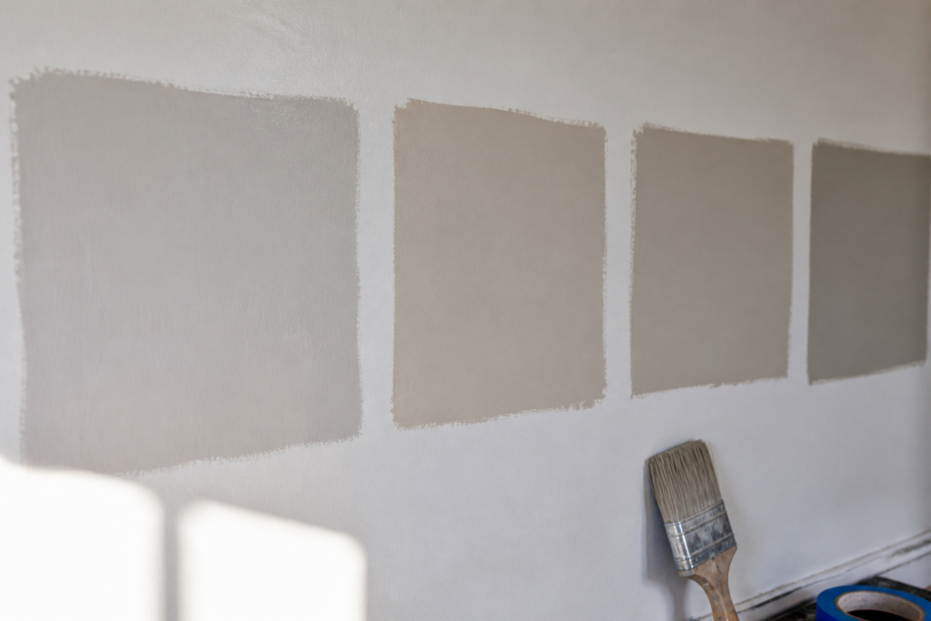
Test in the actual room, not the store. Paint large swatches — at least 12 by 12 inches — directly on the wall, or use peel-and-stick sample boards you can move around. Observe them at different times of day and under both natural and artificial light before committing.
Look at the undertone, not just the color. Every paint color has an undertone — a subtle secondary hue that becomes visible in certain lighting conditions or next to other colors. A “greige” that looks perfectly neutral in the store can read distinctly pink or green on your walls. Hold the sample next to your flooring and furniture to check for undertone conflicts.
Use the 60-30-10 rule as a starting point. In a balanced room, roughly 60% of the color comes from walls and large surfaces, 30% from furniture and upholstery, and 10% from accessories and accents. Paint typically occupies that dominant 60% — which is exactly why it needs to be chosen in relation to everything else.
Don’t match — coordinate. Trying to match paint exactly to a fabric or flooring color usually results in a flat, monotone room. Instead, pull a tone that’s adjacent on the color wheel or a lighter/darker value of the same hue. Coordination creates depth; matching creates visual noise.
Sample the ceiling too. Most people paint ceilings white by default, but a ceiling color slightly lighter than the walls — or a warm white instead of a stark one — can dramatically change how a room feels. Designers rarely overlook the fifth wall.
Give yourself a 48-hour rule. Never approve a paint color the same day you sample it. Live with the swatches through a full day-night cycle. Colors that look perfect at noon can feel completely wrong under evening lighting.
Frequently Asked Questions
Why do interior designers choose paint last?
Because paint is the most flexible and reversible element in a room. Flooring, cabinetry, countertops, and large furniture are expensive and difficult to change — so they anchor the color palette. Paint is chosen to complement those fixed elements, not the other way around.
What should I choose before picking a paint color?
Prioritize flooring, cabinetry, countertops, and large upholstered furniture first. These fixed elements carry undertones that will influence how any paint color reads in the space. Once they’re selected, the right paint color becomes much easier to identify.
How do professional designers choose paint colors?
They identify the undertones running through the room’s fixed elements, then select a paint color that harmonizes with or deliberately contrasts those tones. They also test samples in the actual room under real lighting conditions — never relying solely on store samples or digital swatches.
Can I choose paint first if I’m redecorating from scratch?
It’s possible, but risky. If you choose paint first, every subsequent purchase — furniture, rugs, textiles — has to work around that color, which limits your options and often leads to compromises. The designer approach of selecting fixed elements first gives you more flexibility and better results.
How do I know if a paint color has the wrong undertone for my room?
Hold a large paint sample next to your flooring and dominant furniture. If the color suddenly looks pink, green, yellow, or purple in a way that feels off, you’re seeing an undertone conflict. The fix is to choose a paint with a complementary undertone rather than a competing one.
What’s the best way to test paint colors before committing?
Paint large swatches directly on the wall — at least 12 by 12 inches — or use repositionable sample boards. Observe them at multiple times of day, under both natural light and your artificial lighting. A color that looks right at noon may look completely different at 8 PM under warm LED light.