What color goes with pink?
If you are looking for a quick answer: the colors that complement pink best are slate blue, olive or sage green, rich burgundy, and sophisticated neutrals like charcoal and warm beige. For energetic and modern spaces (or matching pink clothes), copper, mustard yellow, and even black pair wonderfully with both pastel and vibrant pink shades.
At our Navilize design studio, we handle dozens of color palette requests every month. Pink used to be seen as just a “nursery color,” but in recent years, we’ve used it in modern living rooms, minimalist bathrooms, and bold commercial spaces. The secret isn’t just picking pink; it’s knowing exactly what to pair it with.
Based on our recent interior design projects and fashion color theory, here are the 13 best colors that go with pink, complete with HEX codes and mood profiles to help you get it exactly right.
1. Slate Blue (The Sophisticated Contrast)
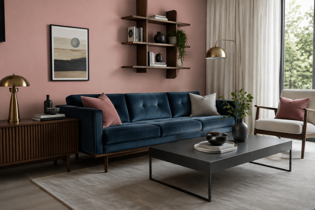
We recently finished a mid-century modern living room project where the client wanted blush pink but didn’t want the room to feel “too sweet.” Our solution? Slate blue. The cool, muted tones of slate blue perfectly balance the warmth of pink. It creates a grounded, mature look.
- Best For: Living rooms, bedroom accent walls, and tailored suits in fashion.
- Mood: Calm, grounded, and modern.
- Try This Palette: Blush Pink (
#FFD1DC) + Slate Blue (#5B7C99) + Cream (#FFFDD0).
2. Copper & Terracotta (The Earthy Warmth)
If you want a space to feel inviting and warm, metallic copper or flat terracotta are your best friends. In a recent kitchen remodel, we paired soft pink cabinets with brushed copper hardware. The reflection of the metal against the matte pink was stunning and felt incredibly organic.
- Best For: Kitchens, dining areas, and autumn wardrobe styling.
- Mood: Earthy, warm, and luxurious.
- Try This Palette: Dusty Rose (
#DCAE96) + Copper (#B87333) + Charcoal (#36454F).
3. Sage Green (The Natural Complement)
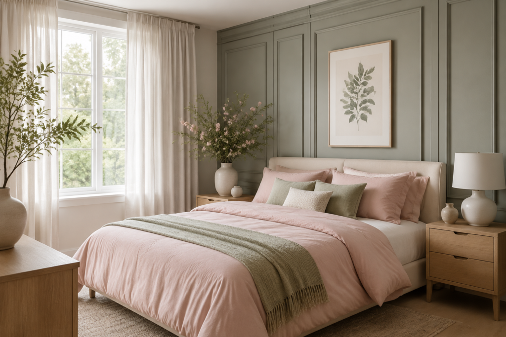
Look at a rose bush—nature already proved that green and pink are a perfect match. Sage green, with its grayish undertones, acts almost like a neutral. We frequently use this combo in bedrooms because it lowers the visual temperature of the room, making it incredibly relaxing.
- Best For: Bedrooms, bathrooms, and spring fashion outfits.
- Mood: Organic, fresh, and calming.
- Try This Palette: Soft Pink (
#FFC0CB) + Sage Green (#9DC183) + Off-White (#FAF9F6).
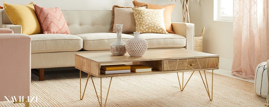
4. Mustard Yellow (The Retro Pop)
For our clients who love a bit of retro or eclectic flair, mustard yellow and pink is a go-to combination. We styled a boutique hotel lobby recently using mustard velvet armchairs against a pale pink mural. The yellow adds a burst of energy without clashing.
- Best For: Creative offices, eclectic living rooms, and statement fashion pieces.
- Mood: Energetic, vintage, and creative.
- Try This Palette: Bubblegum Pink (
#FFC1CC) + Mustard (#FFDB58) + Warm Grey (#808080).
5. Charcoal Grey (The Masculine Balance)
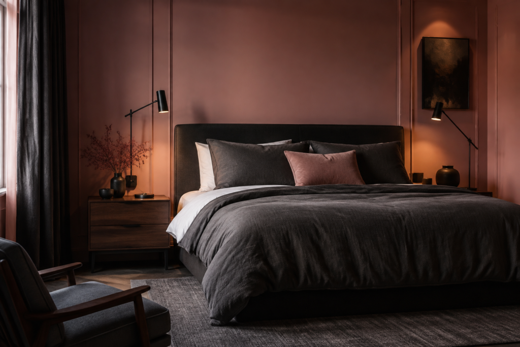
Often, people worry that pink is too feminine for a shared space. Charcoal grey is the ultimate neutralizer. In a recent master bedroom design, we used dark charcoal for the bed frame and textiles, allowing the dusty pink walls to act as a soft, neutral backdrop rather than the main event.
- Best For: Master bedrooms, modern exteriors, and winter coats.
- Mood: Moody, balanced, and sophisticated.
- Try This Palette: Dusty Pink (
#D8A7B1) + Charcoal (#36454F) + Pure White (#FFFFFF).
6. Navy Blue (The Timeless Classic)
Navy and pink is a preppy, traditional combination that never goes out of style. Unlike black, which can sometimes look too harsh against lighter pinks, navy offers a softer, deeper contrast. We love using navy cabinetry with subtle pink backsplashes.
- Best For: Traditional living rooms, coastal homes, and formal wear.
- Mood: Classic, reliable, and sharp.
- Try This Palette: Millennial Pink (
#F3E5AB) + Navy Blue (#000080) + Gold (#FFD700).
7. Burgundy / Wine (The Monochromatic Depth)
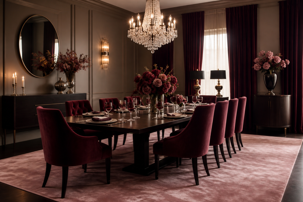
Layering colors from the same family creates a rich, enveloping feel. Burgundy and light pink work beautifully together through the concept of monochromatic scaling. In our luxury design packages, we often pair a light pink silk rug with deep burgundy velvet curtains.
- Best For: Dining rooms, home libraries, and evening gowns.
- Mood: Romantic, deep, and luxurious.
- Try This Palette: Pale Pink (
#FADADD) + Burgundy (#800020) + Taupe (#483C32).
8. Gold and Brass (The Glamorous Accent)
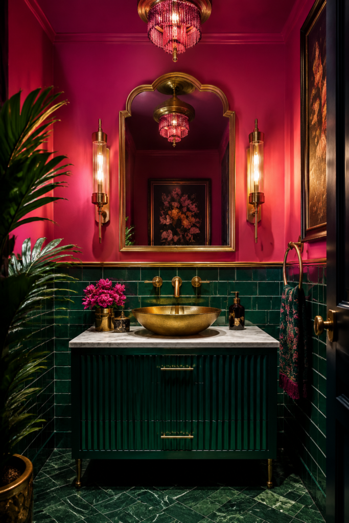
You rarely see a highly designed pink room without a touch of gold or brushed brass. Warm metals elevate pink instantly. When we source lighting fixtures for pink rooms, we almost always opt for unlacquered brass or matte gold to give the space a chic, expensive feel.
- Best For: Bathrooms, vanity areas, and jewelry pairing.
- Mood: Glamorous, chic, and bright.
- Try This Palette: Rose Pink (
#FF66CC) + Gold (#D4AF37) + Black (#000000).
9. Olive Green (The Rich Earth Tone)
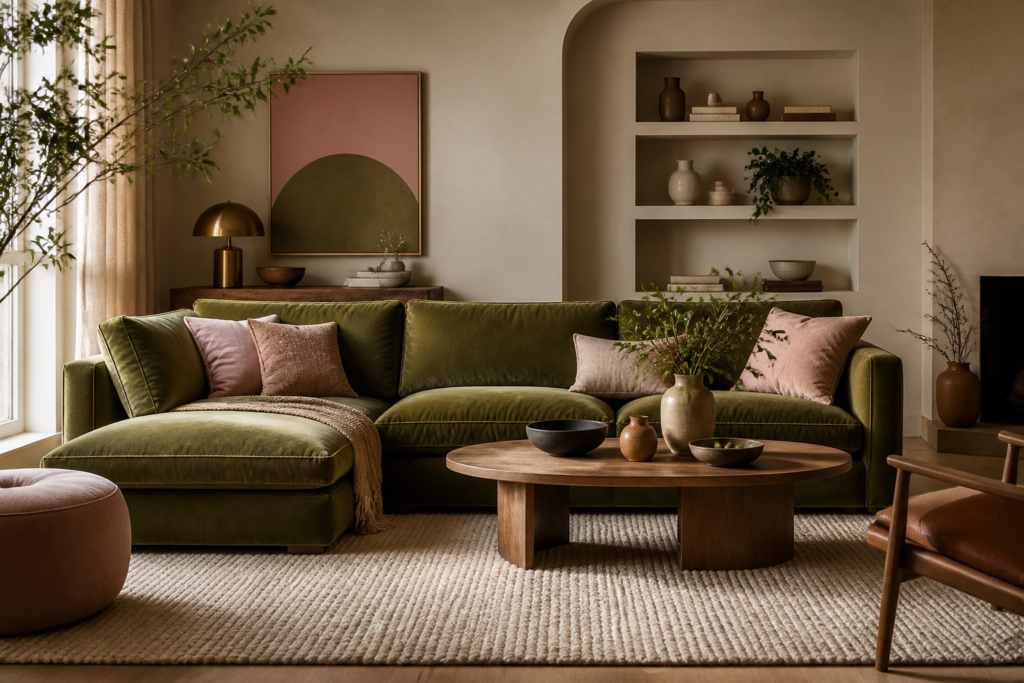
If sage green is too light for you, olive green brings a richer, more grounded vibe. It works exceptionally well with dusty or darker pinks. We recently styled an apartment using an olive green sofa loaded with dusty pink throw pillows—it was an instant hit.
- Best For: Living room furniture, home offices, and casual streetwear.
- Mood: Earthy, cozy, and mature.
- Try This Palette: Muted Pink (
#E0B0FF) + Olive Green (#556B2F) + Cream (#FFFDD0).
10. Crisp White (The Clean Slate)
When in doubt, open the space up. Pairing pink with pure, crisp white allows the pink to be the absolute star of the show. This is our standard recommendation for small spaces or rooms with low natural light, as the white reflects light while the pink adds personality.
- Best For: Nurseries, small bathrooms, and summer dresses.
- Mood: Light, airy, and clean.
- Try This Palette: Peachy Pink (
#FFDAB9) + Crisp White (#F5F5F5) + Light Wood (#DEB887).
11. Matte Black (The Edgy Anchor)
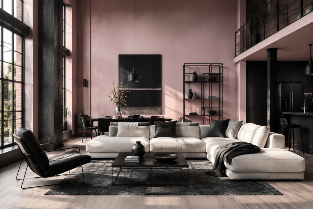
Pink and black is a bold choice. To avoid it looking like a retro 2000s teenager’s room, the secret is in the finishes. We use matte black hardware, window frames, or accent chairs paired with a very soft, sophisticated blush. It creates an edgy, modern industrial vibe.
- Best For: Modern lofts, industrial spaces, and high-fashion outfits.
- Mood: Bold, edgy, and high-contrast.
- Try This Palette: Blush (
#DE5D83) + Matte Black (#1C1C1C) + Ash Wood (#B2BEB5).
12. Warm Cream / Beige (The Cozy Alternative)
If crisp white feels too sterile, swap it for a warm cream or beige. This is the foundation of the “quiet luxury” trend we are seeing so much of at Navilize. Cream warms up the pink and makes a room feel incredibly inviting and soft.
- Best For: Guest bedrooms, cozy living rooms, and knitwear.
- Mood: Soft, inviting, and luxurious.
- Try This Palette: Light Coral Pink (
#F08080) + Cream (#FFF8DC) + Warm Brown (#8B4513).
13. Emerald Green (The Jewel Tone Pop)
For our maximalist clients who aren’t afraid of color, emerald green and pink is a showstopper. Because they are opposite on the color wheel, they create maximum visual interest. We love using emerald green tiles with pink grout, or vice versa, in bold powder rooms.
- Best For: Powder rooms, accent furniture, and statement accessories.
- Mood: Bold, eclectic, and rich.
- Try This Palette: Magenta Pink (
#FF00FF) + Emerald (#50C878) + Brass (#B5A642).
What Color Goes With Pink Clothes? (Fashion & Style Guide)
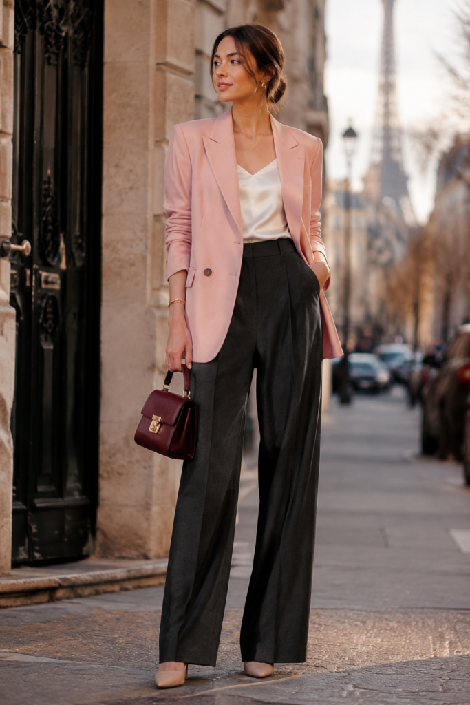
Many of our readers ask us about matching colors for their wardrobes, not just their walls. The rules of interior design often apply directly to fashion. If you are standing in front of your closet wondering what to wear with a pink piece, keep these real-world styling tips in mind:
- For Light/Baby Pink: Pair it with light wash denim (blue), crisp white, or light grey for a daytime look. If you want to make it edgy, a black leather jacket over a blush pink dress is a classic contrast.
- For Hot Pink / Fuchsia: This is a statement color. Tone it down with navy blue or charcoal. If you want to lean into the boldness, color-block it with tangerine (orange) or bright red.
- For Dusty Pink: This pairs beautifully with other earthy tones. Think olive green cargo pants, beige trench coats, or rich brown leather accessories.
Ready to Transform Your Space?
Choosing the right color palette is just the first step. If you love the idea of incorporating pink—or any other bold color—into your home but aren’t sure how to execute it without making the space feel cluttered, we can help.
At Navilize, our team specializes in turning these color theories into real, livable spaces tailored to your personal style. Whether you just need a color consultation or a full room redesign, let’s build a space you actually want to spend time in.
Frequently Asked Questions
What is the best complementary color for pink?
Based on color theory, the direct complement to pink is green. For interior design and fashion, we highly recommend sage green for a soft, natural look, or emerald green if you want a bold, high-contrast statement.
Does grey go well with pink?
Absolutely. Grey is one of the most reliable colors to pair with pink. Light grey combined with baby pink creates a soft, Scandinavian vibe, while charcoal grey paired with dusty rose offers a moody, sophisticated, and mature aesthetic.
How can I use pink in a living room without it looking childish?
The trick is to avoid highly saturated “bubblegum” pinks. Instead, opt for muted shades like blush, dusty rose, or terracotta-pink. Pair these sophisticated shades with mature neutrals like navy blue, olive green, or matte black, and incorporate rich textures like velvet or brushed brass.
What colors clash with pink?
While you can make almost any color work with the right undertones, bright primary red or neon orange can clash heavily with standard pink, creating a chaotic visual. If you want to pair pink with red, lean into a deliberate “color-blocking” style using magenta and deep burgundy instead.
Can I wear pink with brown?
Yes! Pink and brown is a highly underrated combination. Light pink pairs beautifully with chocolate brown for a retro, warm aesthetic, while dusty pink works perfectly with lighter camel or beige tones for an elegant, earthy outfit.